
Explainers – Selected samples and example formats
Data and infographic explainers
In my time at both The Conversation and The Pharmaceutical Journal I’ve produced and edited data packs, maps and other formats to explore, unpack and explain complex topics to our readers.
An investigative explainer on the increasingly segmented pharmacy market, covering the per capita fall in pharmacies in regions across the UK since 2018 and mapping specific closures.
A chart-based explainer from one of the nine Australian federal budgets I covered at The Conversation, explaining the changes in spending, deficits or surpluses and long-term accounts.
A simple chart pack and walk-through of the biggest stories in the 2021 Australian Census data.
An animation-based explainer on pumped hydro electricity, to help readers understand what Australia’s Coalition government planned with its announced Snowy 2.0 scheme in 2019.
A deceptively simple mapping project exploring and explaining the impact of underinsurance and inequality in disaster recovery.
Comics
During my time at The Conversation I developed, illustrated and edited a series of comic explainers on difficult, abstract or complex topics. In each case, the comics were built out of extensive research and long-form interviews, in conjunction with the academic authors.
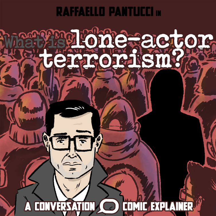
An explainer comic at The Conversation exploring the stats on lone-actor terrorism, its causes and potential ways to address it, with academic expert Raffaello Pantucci.

An explainer and series of comic case studies of cases of modern slavery and trafficking in Australia for The Conversation.

How memory works, with Dr Jee Hyun Kim at The Conversation, the first in our series and a test for what was to come!

A comic on hollow-bearing trees and the important role they play in biodiversity and protecting endangered wildlife at The Conversation.
Medium and large scale interactives

A microsite for The Conversation that explores the impact of the 2019-20 bushfires on 119 different Australian species and their recovery by mid-2020. This project won the The Universities Australia Award for Excellence in University Research Reporting from the National Press Club, and was shortlisted for the Eureka Science Award for science reporting.

A microsite and interactive mapping the path of Cook and the Endeavour through the Pacific, the impact of colonialism and the Indigenous perspective and response. This project was shortlisted for the Excellence and Innovation in Visual Digital Storytelling, Small Newsroom Online Journalism Award.
An interactive explainer at The Conversation on the Strait of Hormuz following Australia joining the US-led naval convoy.
An rpg-style interactive for The PJ on the complex path to becoming an indepedent prescriber across three separate sectors.
An interactive graphic from just prior to the 2019 Federal state election covering all available data on the controversial Adani Carmichael coal mine for The Conversation.
Video and animation
The first in a series of four videos explaining the effects of alcohol on the body and brain. Republished by the Hong Kong’s Department of Health as part of their UN sustainability goals, incorporated into the Red Cross’ save-a-mate harm reduction program and featured as an Apple News headliner.
A Q&A video shot very early in the COVID pandemic (March 2020), just before Australia went into the first of its lockdowns (in Melbourne), which covered off questions from readers and staff about the virus and what it's likely impact would be. It was turned around within a day, picked up by many republishers, and produced as also an article transcript and a podcast. Many of the more ambitious answers (particularly on the speed of vaccines arriving) were proven right over the following years.
A video shot, directed and edited by Chynthia Wijaya-Kovac, my deputy at the time at The Conversation, for which I was the supervising editor and producer.